


Ted Nelson's Computer Paradigm,
Expressed as One-Liners
[ INOPERATIVE NOTE FROM 1999: Transcopyright 1999
Ted Nelson. Please quote on the Web only by using transquotation
strings (TQstrings), which will soon be available for this page.) Note:
Web transquotation doesn't work. ]
The purpose of computers is human freedom. -- T.Nelson, Computer Lib, 1974
No one's life has yet been simplified
by a computer.-- T.Nelson, Computer Lib, 1974
In 1974, computers were oppressive devices
in far-off airconditioned places.
Now you can be oppressed by computers in your own living room.-- T.Nelson, Computer Lib, 1987 edition
The Dream
Beginners have the notion that computers can help them stay organized all the time and make life easier. Then they have to face the incredible difficulty and disappointment of learning today's systems, and either give up or settle for far less.Today's Computer World (miscellaneous remarks)I believe that original dream is still possible for everyone. But not with today's systems.
"Microsoft is not the problem. Microsoft is the symptom." -- Eric S. Raymond
.
A&T created Microsoft by charging $25,000 for Unix.
If they'd charged $50, Unix would be the world standard.This can't go on. I believe we have reached the event horizon of complication and crap (craplexity). The present paradigm is in for a big fall. That is my hope and the center of my effort.
Why are video games so much better designed than office software?
Because people who design video games love to play video games.
People who design office software look forward
to doing something else on the weekend.People ask me, "Ted, what's the difference between 'word processing' and 'desktop publishing'?" How the hell should I know? These are marketing terms, referring to packages set up for reasons that have nothing to do with conceptual sense or the user's good.


Calling a hierarchical directory a "folder" doesn't change its nature any more than calling a prison guard a "counselor". (Zimbardo's prison experiments showed that prison-guard behavior is structural, and so are the effects of hierarchical directories.)
 The
Lies of "Computer Basics"
They tell you that files are hierarchical; that the basic programs are word processing, database and spreadsheet; that you must use "applicatons"; and that you must butcher and shoehorn what you really want to do into hierarchical files for use with "specific applications".Actually these are half-lies. They describe the computer world as it is, but not as it can and should be.
 The
Myth of "Technology"
A frying-pan is technology. All human artifacts are technology. But beware anybody who uses this term. Like "maturity" and "reality" and "progress", the word "technology" has an agenda for your behavior: usually what is being referred to as "technology" is something that somebody wants you to submit to. "Technology" often implicitly refers to something you are expected to turn over to "the guys who understand it."This is actually almost always a political move. Somebody wants you to give certain things to them to design and decide. Perhaps you should, but perhaps not.
This applies especially to "media". I have always considered designing the media of tomorrow to be an art form (though an art form especially troubled by the politics of standardization). Someone like Prof. Negroponte of MIT, with whom I have long had a good-natured feud, wants to position the design of digital media as "technology". That would make it implicitly beyond the comprehension of citizens or ordinary corporation presidents, therefore to be left to the "technologists"-- like you-know-who.
I believe the principal issues of media design are vital for tomorrow's understanding, freedom and survival, and should be a matter for public understanding and debate, not merely the decisions of the XML committee, corporate startups or Ph.D. candidates trying to do flashy new stuff, or glitzy fund-raisers.
Hypertext is not technology but Literature. Literature is the information that we package and save (first just books and newspapers and magazines, now movies and recordings and CD-ROMs and what-all). The design of tomorrow's literature determines what the human race will be able to keep track of and understand. These are not issues to be left to "technologists".
The Myth of "Information"
"Information", referred to as a commodity, is a myth. Information always comes in packages (media bundles, called "documents" (and sometimes "titles")), and every such package has a point of view. Even a database has a point of view.The Myth of "Logical Thinking"If a document or a database doesn't seem to have a point of view, that's like meeting a person who doesn't seem to have an accent. The person, or the document, has the same accent or or point of view that you do, so it's invisible.

Users are told that learning to use computers is "learning to be logical". This is nonsense. You are learning to think like the guy who is conning you, though he probably does not realize it.."Logic" (deductive logic) is an intricate game of figuring out what you've already said; it is virtually useless in everyday life, where deduction from explicitly stated premises almost never occurs.
So when you're praised for "logical thinking", it means you've absorbed a paradigm and can now step through it like the person who is praising you.
 Cybercrud
Cybercrud means "putting things over on people using computers" (Computer Lib, 1974). The trick is to make people think that a certain paradigm is inevitable, and they had better give in. Computer guys have this ploy down cold.
 The
Slavery of "Applicatons"
In the nineteen-sixties, IBM invented customer slavery-- because the products were beyond the user's control, the user had to pay not just for software, but for upgrades, and for the suffering of living through those upgrades. That's like certain governments billing the family for the bullet used to kill their son.
In 1974, when I published Computer Lib, there were relative few computers, and they were big beasts in airconditioned rooms that were programmed oppressively. Now, with today's computers, you can be oppressed in your own living room! And millions are.
An "application" is a closed package of function. You don't own your data, THEY do. You don't control the interface, THEY do. You have only the options they give you. They can change the software, make you buy the new version, and make you endure the inconvenience of learning and adapting to the new version. Which is very probably not what you want, but you can't change it, you have to learn to live with it.Every "application" has its own way of dividing its domain into parts, tying the parts together, and accessing the parts-- the same things that other software does, in the same domain and other domains. But the controls and options are all different, and you can't carry them across applications. You have to learn special, local ways to do what you should be able to do freely. Applications are prisons, going from application to application is like being a prisoner bussed between prisons, and "exporting" and "importing" data is like mailing something to a prisoner.
In Unix, you can pretty much do anything. There are no "applications". You can run any program on any data, and if you don't like the results, throw them away. Computer liberation will mean empowering users to have this same kind of control.
 The
Tyranny of the File
A file is a large lump of data with a fixed name and location, whose contents may or may not change, The file may be used for internal implementation but unpleasantly intrude on the user's conceptual space. Or the file lump may be the unit the user is requred to deal with.Files have names, and can be referred to throughout your computer. But a file may include pieces of data which do NOT have names, and CANNOT be referred to elsewhere. Sometimes this is what you want. But often you would like to be able to refer to the smaller units WITHOUT names, and often you wish you did not have to refer to the larger ones WITH names.
Here are some of the real problems, I believe, of data management-- which the prevailing file model does not in any way help with:
¶ We need software for maintaining continuity in creative work-- in which project boundaries and names are constantly overlapping, changing and interconnecting.
¶ We need to maintain connections to, and in, an ever-changing body of media contents-- media contents that are constantly moving among locations, without regard to where the contents are stored or cached.
 The
Nightmare of Hierarchical Directories
Hierarchical directories were invented around 1947-- it seems impossible to find out when or by whom-- when somebody said, "How are we going to keep track of all these files?" And somebody else probably+ said, "Gee, why don't we make a file that's a list of filenames?" And that was the directory. It's a temporary fix that scales up in the wrong way.Real projects for ordinary people tend to overlap, interpenetrate, and constantly change. The software requirement of their staying in one place with a fixed name is inane. The problem is much harder.
 The
folly of "Metaphors"
Consider the "desktop". When people referred to a screen with icons and windows as a "desktop" this had to be explained to me--I've never seen a desktop that was vertical, or where you could poke the corner of a piece of paper that was under something, and have it jump to the front.Why aren't there any other designs? Why are the icons the same size?
My favorite metaphor. Consider the "clipboard" on the Mac, PC or XWindows. It's just like a regular clipboard, except (a) you can't see it, (b) it holds only one object, (c) whatever you put there destroys the previous contents. Aside from that, IT'S JUST LIKE A REGULAR CLIPBOARD IN EVERY OTHER RESPECT-- EXCEPT THERE AREN'T ANY OTHER RESPECTS!
This is called a "metaphor".* I see this pseudo-clipboard as stupidity at its height: a really terrible, destructive mechanism, excused by a word that makes it sound somehow okay. It is a further offense-- the greatest atrocity in the computer field, I believe-- that the crippled and destructive functions of this pseudo-clipboard have been falsely given the names "cut" and "paste"-- which for decades have meant something ENTIRELY different to writers, the function of parallel rearrangement with all things visible.
Metaphors are scraps of resemblance that tie us down. Software should instead be designed without regard to past resemblances, with independent conceptual structure that may take any appropriate shape.
 The
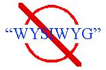
Crime of WYSIWYG

The Macintosh PUI interface, now everywhere, was praised for its embodiment of the WYSIWYG philosophy ("What You See Is What You Get"). Unfortunately the WYSIWYG idea actually meant, "What you see is what you get WHEN YOU PRINT IT OUT". Therefore this high-sounding motto was about using the computer as a paper simulator. Imitating paper on a computer screen-- as almost all consumer applications presently do-- is like tearing the wings off a 747 and using it as a bus on the highway.What we really need is software designs that go into realms that cannot be visualized on paper, to break ideas and presentations out of their four-walled prison.
 "Cyber-"
means 'I do not know what I am talking about'
"Cyber-" is from the Greek root for "steersman" (kybernetikos). Norbert Wiener coined the term "cybernetics" for anything which used feedback to correct things, in the way that you continually steer to left or right to correct the direction of a bicycle or a car. So "cybernetics" really refers to control linkages, the way things are connected to control things.Because he was writing in the nineteen-forties, and all of this was new, Wiener believed that computers would be principally used for control linkages-- which is if course one area of their use.
But the term "cybernetics" has caused hopeless confusion, as it was used by the uninformed to refer to every area of computers. And people would coin silly words beginning with "cyber-" to expand ideas they did not understand. Words like "cyberware", "cyberculture", "cyberlife" hardly mean anything. In general, then, words beginning with "cyber-" mean "either I do not know what I am talking about, or I am trying to fool and confuse you" (as in my suggested cybercrud).
 Intelligent
Gadgets, Intelligent Clothing, Intelligent Chewing Gum, etc.
The word "intelligent" is part of this same tradition. People talk about "intelligent controllers", "intelligent interfaces" when they mean there's a program in it somewhere. PLEASE-- let's not demean the term "intelligence" by bestowing it lightly on drivers, buffers and other lowly programmed gizmos.
And please, Mr. Programmer, leave the choices to ME, not labyrinths of software outside my control, because I DO NOT TRUST YOU.
 "Virtual
Reality"-- a contradictory term
The term "virtual reality" was coined by a Frenchman in the nineteen-thirties, I believe, but popularized by Jaron Lanier and others. It has several problems:"virtual" is the opposite of "real"-- therefore "virtual reality" is a paradox or oxymoron, which the French like, but it doesn't make much sense.As currently used, it just means THREE-DIMENSIONAL-- but adds confusion. I think if you mean "three-dimensional interactive graphics", you should say "three-dimensional interactive graphics"-- not try to create confusion by pretending you are referring to something more.
There is no point at which you "enter virtual reality". You get what you pay for; the realism of the experience is proportional to the equipment available and the skill of the programmers (for example, the game of DOOM is far more realistic than anyone expected was possible, because the programmers skillfully used fast interaction and blur rather than high resolution).
 "Intelligent
Agents"-- yeah, sure
Today's software doesn't work. Are you telling me that software done in an entirely different way, by people I trust even less, is going to do what I want? If you believe that, there's a bridge I want to sell you ...
 Today's
"GUI" Interfaces
The term "graphical user interface", or "GUI", for today's software appearances and controls, is a sad misnomer.First, there could be many other interfaces which are much more graphical. Yet the Macintosh, Microsoft Windows, and Unix's Xwindows all have THE SAME graphical user interface (in descending order of smooth performance).
All of these clumsy, lookalike interfaces are based on those designed at Xerox PARC in the early 1970s. Therefore they should be called PARC User Interfaces, or PUIs.
They were wonderful and innovative for their time, but are now tired, clumsy and extremely limiting.
 "Intuitive"
Software
"Oh, SURE the Macintosh interface is Intuitive!
I've always thought deep in my heart that command-z should undo things."
-- Margy Levine
The term "intuitive" for interfaces is a complete misnomer. I can think of two meanings in software for which the term "intuitive" is presently used:1. Almost nobody, looking at a computer system for the first time, has the slightest idea what it will do or how it should work. What people call an "intuitive interface" is generally one which becomes obvious as soon as it is demonstrated. But before the demo there was no intuition of what it would be like. Therefore the real first sense of "intuitive" is retroactively obvious.
2. Well-designed interactive software gradually unfolds itself, as in the game of Pac-Man, which has many features you don't know about at first. The best term I've heard for this is self-revealing (term coined by Klavs Landberg).
 "Interfaces"
and Virtuality
Everyone should have the interface they like. This means not having to look at the icon and desktop crud if you don't want to.However, the term "interface" is generally misused. "I don't like the the interface" usually means "I can't understand what the hell is going on", and that's really about the conceptual structure of the program, not the face that's put on it.
When people say "interface", they usually mean VIRTUALITY.
By "virtuality", I refer to the opposite of reality: the seeming of a thing, anything. Most things have both a reality (nuts and bolts) and a virtuality (conceptual structure and feel). A building and a car have a physical reality and a virtuality-- a conceptual structure and feel. The only thing that doesn't have a virtuality is something you're not supposed to know about or feel-- like a fishhook (till it's too late).
We don't usually design software interfaces, we design software virtuality. The only time you design a software "interface" is when a program already exists with very specific functions, and you are just deciding how that function is to be shown to the user. But if you are designing or deciding that function-- which is more usually the case-- then you are designing its conceptual structure and feel, or its virtuality.
Web One-Liners
The Web is a foam of ever-popping bubbles, ever-changing shopwindows..•The Web is the minimal concession to hypertext that a sequence-and-hierarchy chauvinist could possibly make.
Trying to fix HTML is like trying to graft arms and legs onto hamburger.*
* NOTE FROM THE PRESENT (2012):There's got to be something better-- but XML is the same thing and worse. EMBEDDED MARKUP IS A CANCER. (See my article "Embedded Markup Considered Harmful", WWW Journal, Fall 1997.)
In 1999, I meant this as a joke,
but it's exactly what they did.
The arms are called XPOINTER
and the legs are called XPATH.
The hamburger is on the march.
Be careful what you joke about.The Web is a special effects race. FANFARES ON SPREADSHEETS! JUST WHAT WE NEED! (Instead of dealing with the important issues-- structure, continuity, persistence of material, side-by-side intercomparison, showing what things are the same.) The Web gives us cosmetics instead of medicine. We are reliving the font madness of the eighties, a tangent which did nothing to help the structure that users need who are trying to manage content.
The Xanadu® project did not "fail to invent HTML". HTML is precisely what we were trying to PREVENT-- ever-breaking links, links going outward only, quotes you can't follow to their origins, no version management, no rights management.
The "Browser" is an extremely silly concept-- a window for looking sequentially at a large parallel structure. It does not show this structure in a useful way.